
Branding
After collaborating with the client and seeing their sketches on what they were after I came up with a few draft options. The idea was that you are earning money, but there is a full circle in that earning process. I came up with the arrows representing the 4 elements of iearn. They all point back at each other to suggest that you will get something back no matter what way you come in.
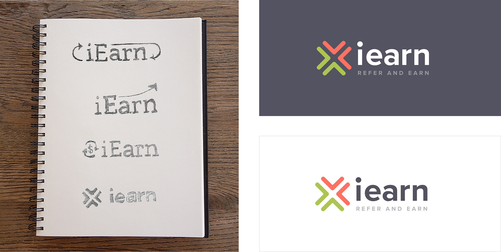
Full Circle
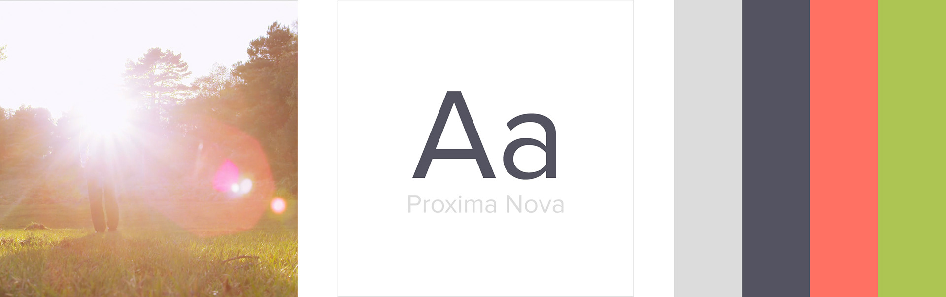
The client was very excited about using green and red, so I came up with a palette that fitted their brief, but bought it into brighter colours that look great on the web.
We used a film for the top of the homepage; this creates the feeling of distance
(which is what iearn is about)
We used a film for the top of the homepage; this creates the feeling of distance
(which is what iearn is about)
Illustration
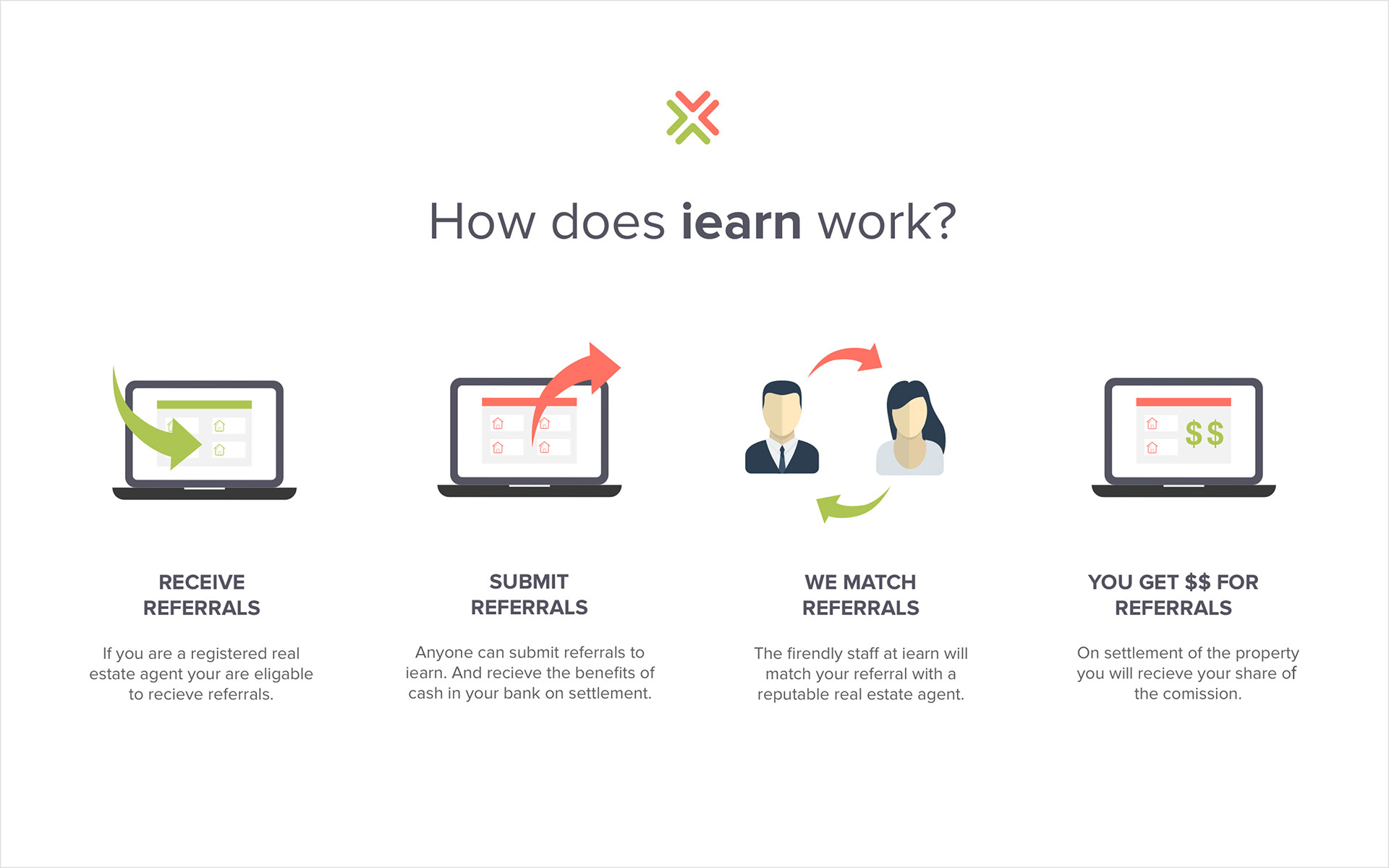
Illustrations were custom designed to express the four areas of iearn. This is where I helped them to define their customer journey, map it out and aligned new illustrations. This also helped with designing the areas for the back end and how we broke it up.
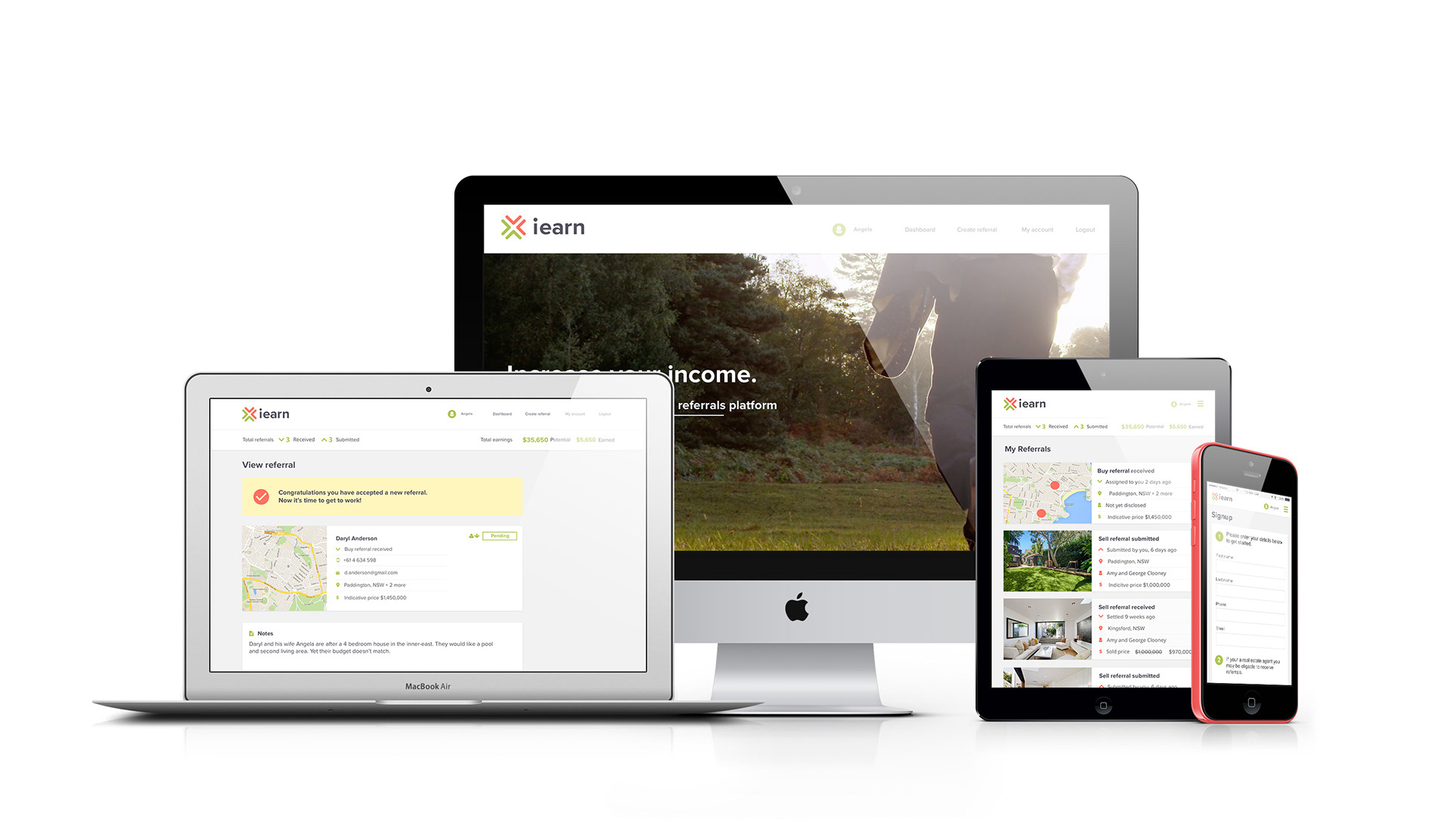
Wireframes
Before we attack the design phase of the project, it's important to get the architecture of the site right. For this part, I worked closely with a UX Architect to get the business plan down, customer journey, site map, and wireframes.
This was a large part of the project as the software that was being built for the back needed clear concise instructions that would help mould the structure of the site.

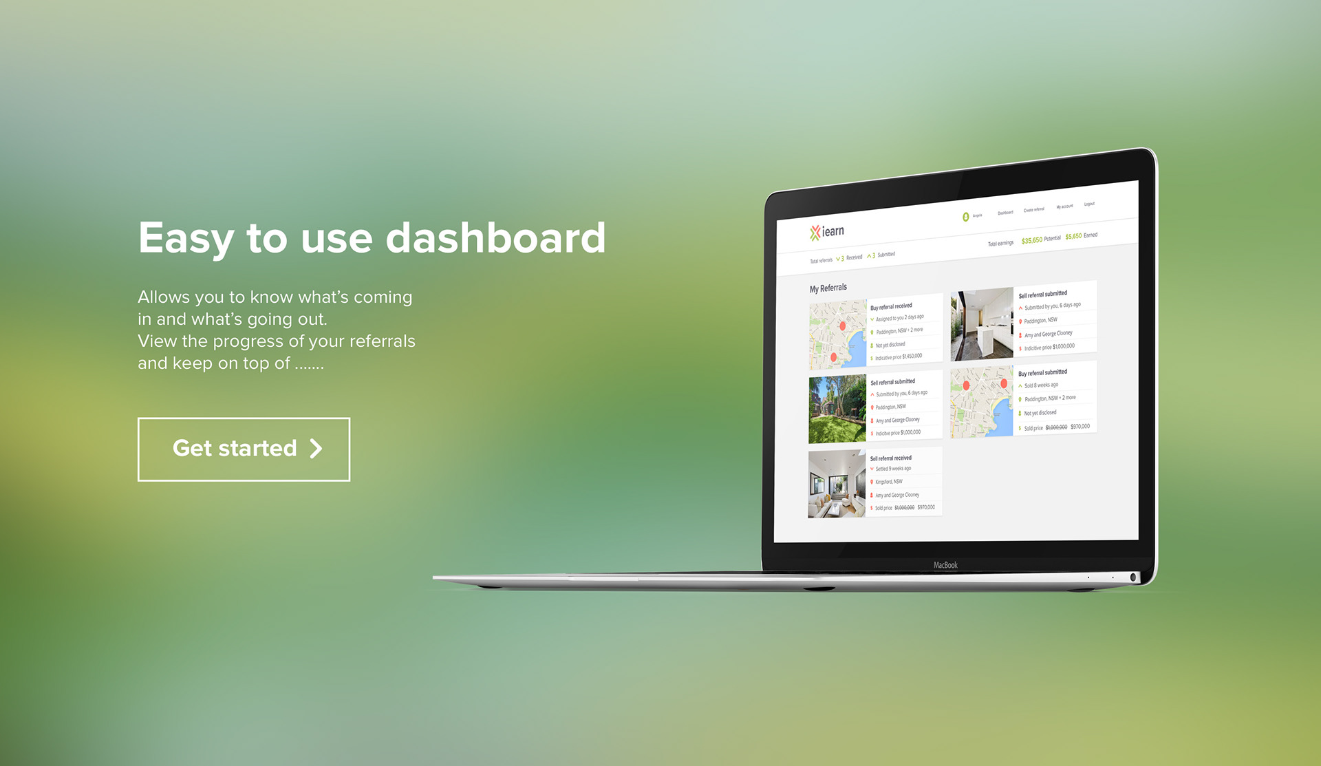
Dashboard
The dashboard design was done in fazes. As illustration was the first thought for the visuals, but as it turns out we went with maps for purchases and images for selling.